The information in the Bill of Materials and Catalogs sometimes is very complex and contains dozens of attributes. Grid is a good way to present them together, but often to have a panel with a set of attributes placed in a vertical column can be very useful. Therefore, we created the Item Information Panel. Sometimes we called just Info Panel.
The picture below is an existing (old version).
Thanks to all users who gave us feedback on the previous design. I hope you will like a new version. Today, I want to preview a new design for user interface for Item Information Panel.
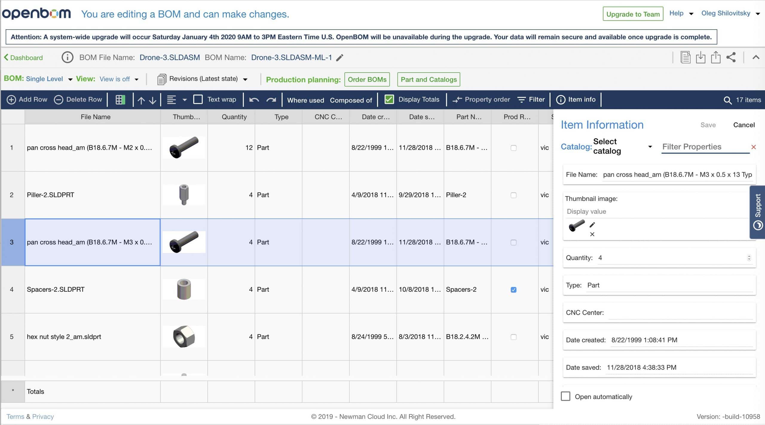
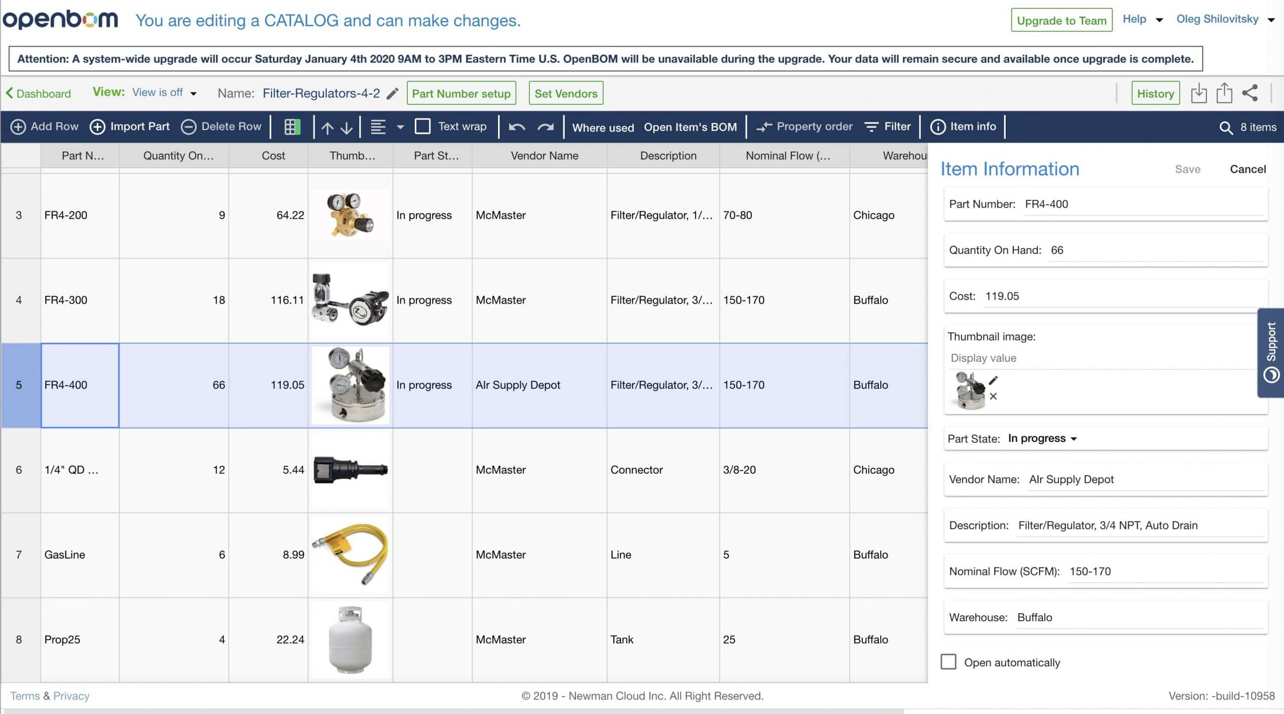
Here are the main key elements of the new user experience:
1- New layout of properties, which is easier to read
2- In-place editing, no need to use a popup for editing
3- Save button (this is how you can use it to make multiple changes)
4- Filter to access specific properties by name (helpful with long lists)
5- Visual indication of read-only and editable properties.
Here is how it looks with BOM (note this version has a selector for catalog and filter)

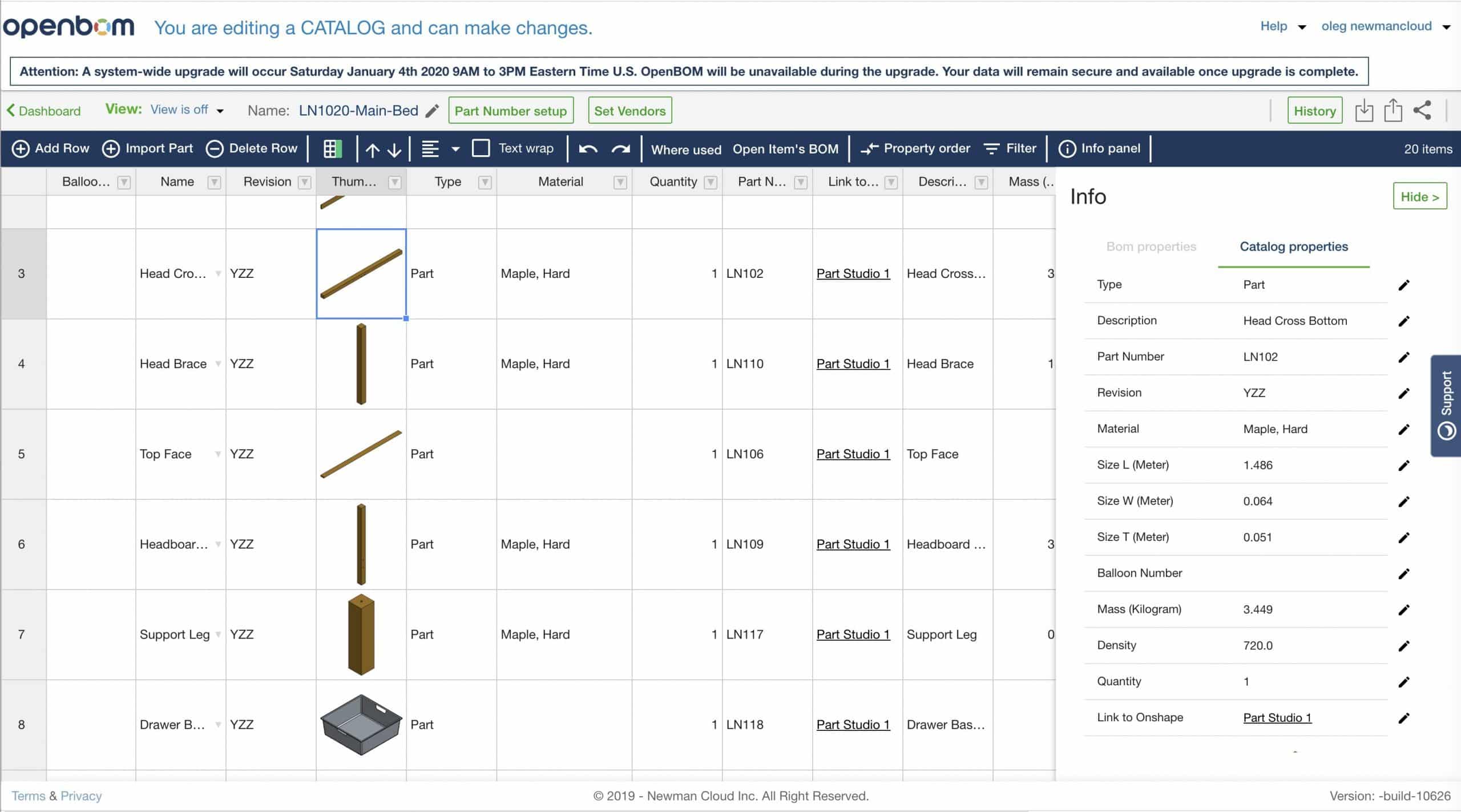
And this is how it looks with the catalog.
The following video can give you some ideas about how it works.
Conclusion.
User experience and the user interface is a very hard thing. We are getting better and I hope you will like a new version of the Item Information Panel. We always welcome feedback. Tell us what you like and what needs to be improved in OpenBOM.
Thank you!
PS. Read OpenBOM customer reviews on G2 Crowd to learn what customers are saying about OpenBOM.
PPS. Try OpenBOM today by registering to FREE OpenBOM User Subscription.
Best, Oleg @ openbom dot com.
Let’s get to know each other better. If you live in the Greater Boston area, I invite you for a coffee together (coffee is on me). If not nearby, let’s have a virtual coffee session — I will figure out how to send you a real coffee.
Want to learn more about PLM? Check out my Beyond PLM blog and PLM Book website
Join our newsletter to receive a weekly portion of news, articles, and tips about OpenBOM and our community.

