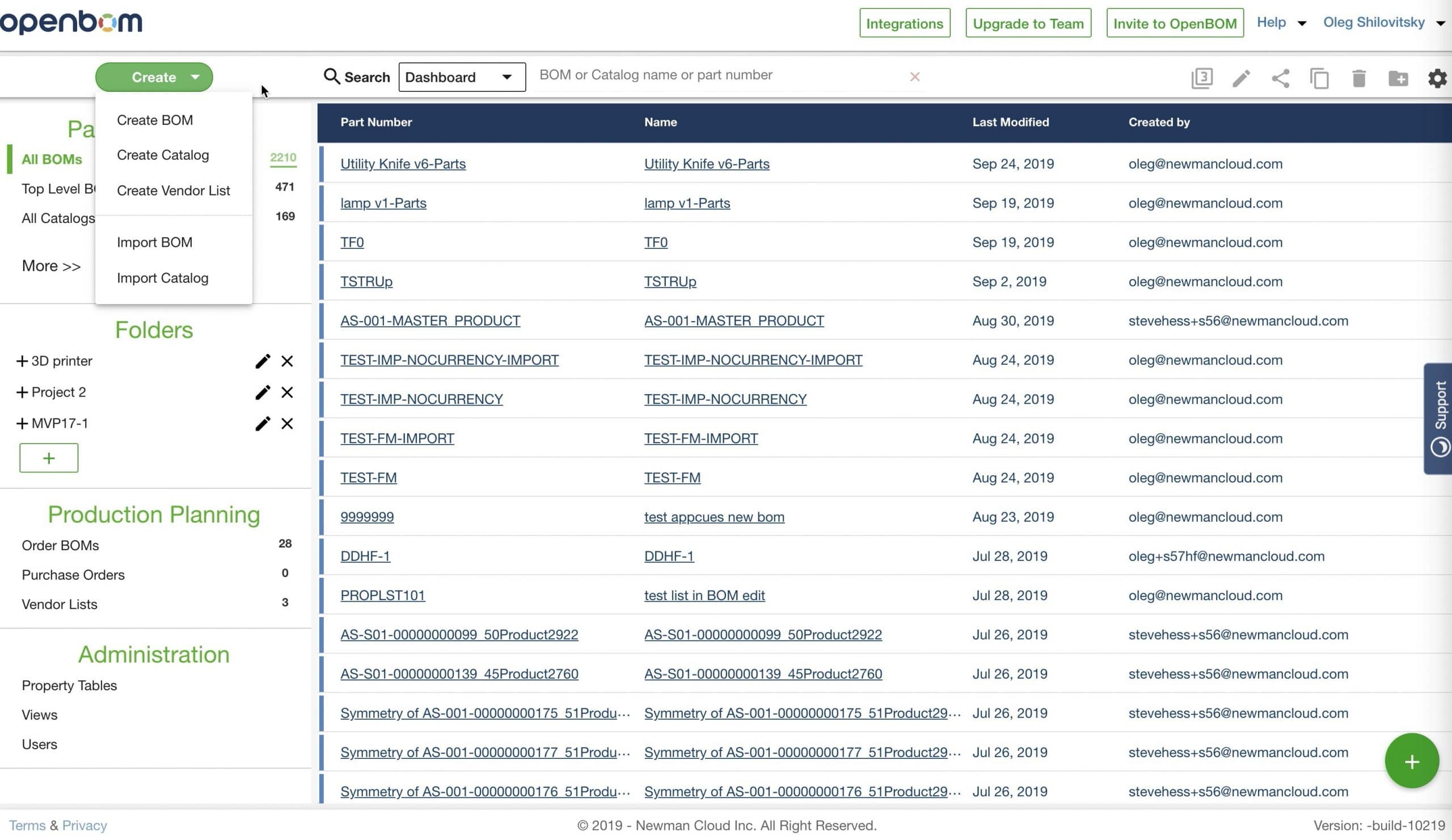
Simple things are hard. In the coming release, we are making changes in an element of OpenBOM user interface that was created a long time ago – OpenBOM Dashboard. We realized the need to do so. And changes will be gradually coming to simplify dashboard functions.
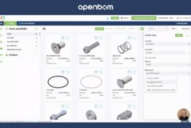
Today, I want to show you an updated dashboard part with the contextual selection of what you see – BOMs, Catalogs, Purchases, Administration functions. As you can see from a picture below the changes in the left side of the dashboard. Thes sections are simpler. Parts and BOMs, Folders, Production Planning and Administration. The search user interface was moved (I will talk about it in my next blog article).
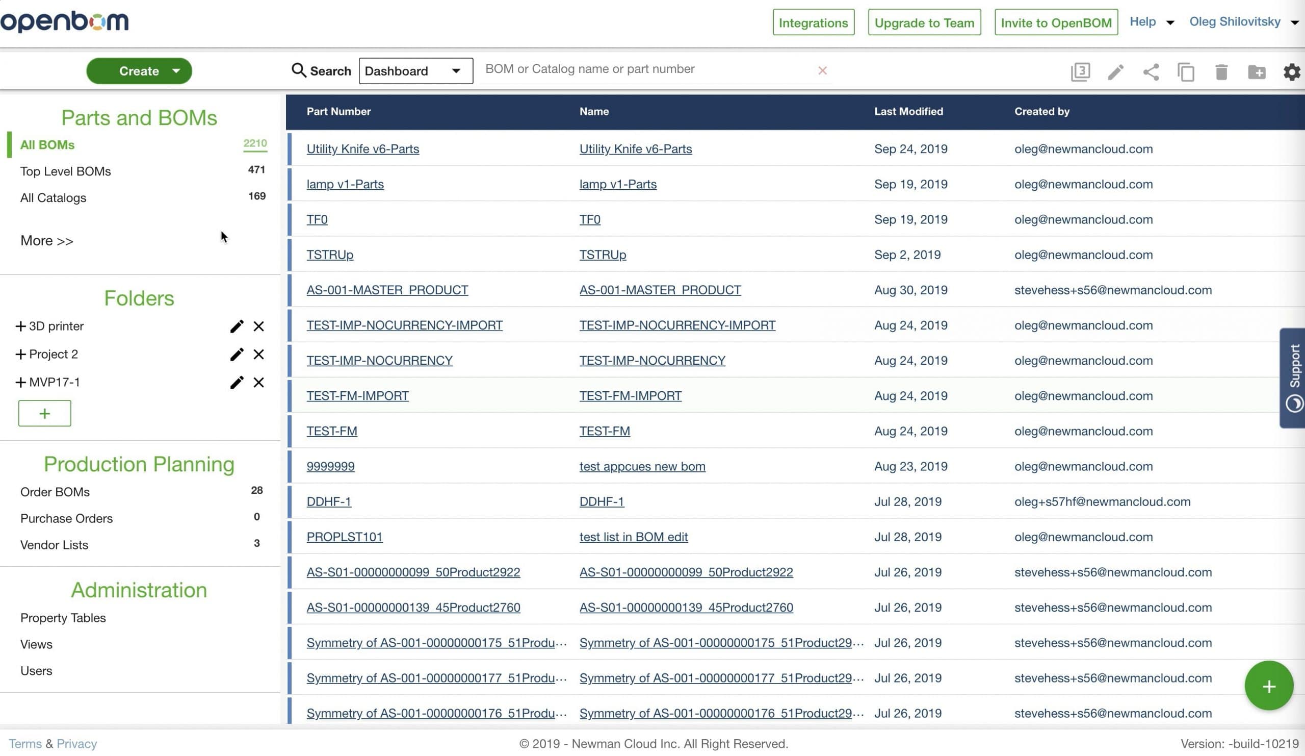
Overall, the dashboard is shorter now. You don’t need to scroll it too much. Some of not frequently used elements are hidden under the “More” function and can be expanded if needed.
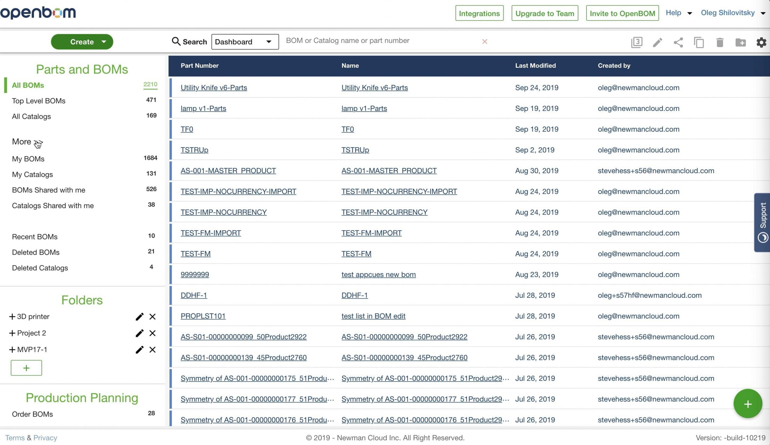
Another change is related to the “Create” function, which is also converted as a single button with a popup list of options.
In the following video, you can see it in actions.
Conclusion
We are making changes in user interface and user experience to make it easier and simpler to use. OpenBOM is growing and we are looking for customers’ feedback and improvements that can be made.
Let me know if you like the change.
Best, Oleg @ openbom dot com.
Let’s get to know each other better. If you live in the Greater Boston area, I invite you for a coffee together (coffee is on me). If not nearby, let’s have a virtual coffee session — I will figure out how to send you a real coffee.
Want to learn more about PLM? Check out my Beyond PLM blog and PLM Book website
Join our newsletter to receive a weekly portion of news, articles, and tips about OpenBOM and our community.

